Wednesday, November 29, 2017

A Picture is Worth a Thousand Words... Thankfully So!

     What a busy few months! I have been editing my story, creating character ideas, and editing my friends cookbook Simply Delicious.

     As far as my book is going, the story is pretty much how I like it but even with all my edits the story is about 400 words too long. Usually picture books are under 1,000 words.

     Applying the saying "A picture is worth a thousand words" might be my answer. Okay, so I need the pictures to be worth at least 400 words. Once I have rough sketches, and can bring the word count down a little more, I will be ready for a few test readers.

     In order to begin planning these "word replacing" illustrations I needed to break the text into pages and spreads. This is the start of a what is considered a picture book dummy. A completed picture book dummy includes the text, a rough idea of where the text will go on the page and rough sketches of the illustrations. This part is going really well. However, it has required a lot more thought and strategic placements than I ever would have imagined. It is an intriguing process.

     Things I learned to consider when making a picture book dummy:
  1. The pace of the story. Making sure there are not too many words on one page with not enough on another.
  2. Creating suspense with page turns. For example a problem comes up but you don't see any resolution until you turn the page. 
  3. Varying the illustration perspectives to create interest. For instance close up view, far away view, how many pictures per page, birds eye or looking up from below, etc.
  4. Pictures books have two typical formats. Typically a 32 page or 24 page layout. Research these layouts before trying to create pages and spreads. It can change where page turns are at in the story.

     To begin making my picture book dummy I printed off my text and slipped it into page protectors. I used wet erase markers to mark it all up with additional edits, places I thought pictures could replace some of the text and where I thought the pages should be broken up. It's a good thing I used wet erase! As I began making my picture book dummy, I realized that I needed to move the page breaks around several times to have a better illustrated story.

     As I tried to visualize how my illustrations might look, I realized that as I had been writing the text the images I had imagined were more like a movie than a picture book. I could see the characters in action.  Now I have to pick out the best visual parts of the "movie" in my brain to share with readers. Kind of a funny thing to realize about my story process.

     Creating characters and illustration ideas has been a lot of fun for me to work on. As I have read to my children, I am always pouring over the illustrations and picking them apart. This has really given me some good insights into what I like and don't like.

     Some things I like to pay attention to when reading a picture book are:
  1. Colors. Are they realistically or creatively used? What do the colors add to the mood of the story? Are they bright or more earthy tones?
  2. What mediums are used to create the pictures?
  3. Are the characters memorable or entertaining?
  4. What do the illustrations add to the text. Is there a side story that you will only catch by looking at the pictures?
  5. Are there borders to the pictures? Do the characters or other parts of the illustrations stay in the border or do they pop out on occasion?
     There is probably so much more, but these are what I notice. As I create the illustrations I want to keep these things in mind and use them to evaluate my own work.

    Working with my friend Mirlandra on her cookbook Simply Delicious was a treat. Even though our books are different there was still a process I got to watch of creating, organizing, editing and then editing it again when I learned something new. It was really neat to see thing come together for her. I only saw a fraction of the work that went into it, but her work really paid off.

     While researching and trying to understand the path to getting published I bought a book. The book is Children's Writers and Illustrators Market 2018. This has been really helpful, especially because you get a year online subscription to Writer's Market with it which has some awesome tools to find agents and lots of resources for learning and connecting you with what you need.

     Learning about agents and what they want, and don't want, has been interesting. Each agent is so different in what type of work they want to see. It is soooo important to do your homework before you submit your work to someone. Find a good match and learn how they want to have work submitted to them for consideration. Because I am both author and illustrator of my book, that also adds an extra twist into how it all works. It also changes who would be interested in looking at my submission.

     My next goals are to finish my picture book dummy and complete rough developments of all the characters in the story. Creating this book is teaching me so much! See you in January... LOL...this book is taking way longer than I imagined!



Wednesday, August 2, 2017

Ripping it apart and building it stronger... just like a muscle?

     The past two months I have worked off and on editing my story. It's been sprinkled in with gardening and family summer fun. I've also started dabbling in colored pencil again. So here is a little about both.

Editing my Story 
 
     Editing my story is taking me a really long time. This is because I decided my story needed to be torn apart and restructured. Editing is like exercising muscles, tearing things down so I can build it back up stronger. It is exciting to see it coming together again. I look forward to being able to share my story with a few beta readers soon. Although, I am a little nervous about it.

     I am realizing that it is a fine line to walk trying to do my best and not giving in to perfectionism. Perfectionism is a crippling problem, it stifles creativity and hinders progress. I don't want the anxiety of stories not being perfect to keep me from writing. Breathe... keep it fun.

Colored Pencils

     This year I've worked with oil pastels a lot. I have learned so much in a short amount of time. I do, however, like to rotate the types of mediums that I'm working with. It keeps it fresh and enjoyable for me. So, for a time, the oil pastels are up on the shelf.

     My husband gave me a new set of colored pencils, which was perfect. I haven't worked with those for a while. I also got my hands on some willow charcoal that I think could be fun to combine with the colored pencil. I have found that I am drawn to illustrations that are created with mixed media. One of my favorites is If I Had a Dragon written by Amanda Ellery and Illustrated by Tom Ellery. It is such a cute, funny story and I love Tom Ellery's use of charcoal, ink and watercolor. Brilliant! 

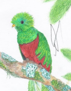
     So, the picture below is not mixed media, but I still wanted to share it. I asked one of my brothers what his favorite bird was. He named a few that he liked and I chose one to be my next picture subject. The one I chose was the resplendent quetzal. I had never heard of it before. At first I thought my brother was being extra fancy by saying a "resplendent" quetzal which made me laugh. Then I realized that resplendent is actually part of its name, giving me another chuckle.

Resplendent Quetzal
Colored Pencil Rendition
Resplendant Quetzal
Photograph by Nick Athanas
antpitta.com
     I chose a photograph by Nick Athanas, a tour guide for Tropical Birding Tours. This picture of a quetzal is one of my favorites because of the up close detail. Being completely unfamiliar with the bird, this was important for me. The composition is simple but interesting.  He has a lot of really great pictures of birds that I have never seen before. (A photo gallery of Neotropical birds).

     This picture took me a lot longer to do than I anticipated. Something I learned while working with the oil pastels is how much you have to build the picture up by layering. I didn't realize it was so similar with colored pencil, until drawing this bird. Applying several layers of different colors gave it a better texture and a richer appearance. The bird didn't feel done until it had many layers. I also used a colorless blender pencil for the first time in this picture. Basically I use it over some of the colors on the paper to smooth them together.

     If you are wondering about the squiggly line behind the bird, that's my youngest sons stamp of approval. I was really frustrated at first. Now that I've had some time to get over it, I can appreciate that he was trying to be a part of making the picture with mom. My older two kids asked if they could have the picture, which was a fun compliment for me. 

     My plan for the next month is to have my story ready for test reading by mid September. Also I will break the story down into what paragraphs will go on what pages in preparation for illustrations to begin.  I hope you are having a fun summer, thanks for following me in this adventure!


Monday, May 22, 2017

ISBN's and Oil Pastel Techniques

     It's been a while since my last post, life is full, good and sometimes a little crazy. In my last post I assigned myself learning about ISBN's and Oil Pastel Techniques. Once again I learned that I didn't know as much as I thought I did! What I am sharing on these topics is to the best of my understanding... If I have something wrong, I'm not offended by kind correction.

Understanding ISBN's   
     ISBN stands for International Standard Book Number. It reminds me of a Social Security number for books. It is specific to the exact edition and format of a book. Many bookstores also use it in combination with bar codes to keep track of inventory and restock their shelves.

     When ready, I can get my ISBN numbers through Bowker Identifier Services which is the only authorized agency to buy it from. If your book is selected by a publisher they can also assign your book an ISBN that they have already purchased. Some self-publishing websites offer free ISBN's as an incentive to use their business. Right now the cost for one ISBN is $125. They also sell bundle packages which brings the cost down. If you want more details about ISBN's here is a link to a brochure from Bowker that is really helpful Bowker US ISBN Agency ISBN Guides: Basic Information.

     Here are a few things that I came across that were very basic but I hadn't even thought about them before:
  • Hardcover and softcover books ARE considered different formats and require separate ISBN's. 
  • Printers and publishers are different.
  • Bar codes are purchased. 
  • It is important to register a copyright of your work within a certain time frame in order to pursue monetary compensations.
     Purchasing an ISBN is a long ways out for me, but I feel much more comfortable with knowing some of the basics. I am confident I could navigate the ISBN process.

Time for a Little Art!   
     There are many different techniques with oil pastels. Below I've posted one of my favorite beginning oil pastel videos. It is a favorite for two reasons.The first reason is I think she did a really good job at showing a basic overview. Another thing I really like is she uses Pentel oil pastels, they are considered an introductory set.

     A lot of the videos are done with expensive artist or professional grade pastels. I'm just trying out pastels and I'm not ready to sink a lot of money into it. The texture of oil pastels can vary greatly, depending on the brand you buy. They can be hard almost like crayons or soft and creamy like lipstick. The texture of the oil pastel makes a HUGE difference on how you can use them. So two thumbs up for a video that shows me how I can use the pastels I already have.


     This next video I also found helpful. I have tried to implement it into much of the work I've done since watching it. If you look at an item it almost always has different highlights. shadows and slightly different shades of color. This gives dimension and interest. The rule of 3's, that the video below introduces, has helped me give better dimension and interest to my projects. 


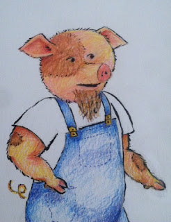
     Here is a drawing I was working on. When I tried to sketch it out in pencil first, I was having a hard time with getting piggy to have the right expression. I couldn't figure out the right angles for the eyebrows and mouth. An idea popped into my head... make the expression I was thinking of and take a selfie! Haha! I'm not one for selfies, but I tried it and it seemed to do the trick. (Sorry, not posting it!) I could reference my expression for facial details in my picture. However, when my pig started looking a little too much like me... I decided I had better stop using my selfie. :) I think I may try and enlist my kids to let me take some good expressive pictures of them for a fun collection to reference.

   
      As for technique with the oil pastels, I chose to layer different colored pastels then use a lighter oil pastel to blend the layers together. I started with drawing the pig in pastel. Then I water colored all around the pig and over the whole rest of the page. Then I finished the outside of the pigs window with several different green and yellow pastels.   

     I've noticed in the beginning stages of drawing with pastels things just don't seem like they are going to look good. But when I keep building up the layers it can polish up really nicely. One thing that was mentioned in the first video clip above was the idea to get a higher quality white pastel that would make adding highlights at the end a little easier. I might have to try that. 

     One comment I heard a few times about this picture was "what are those yellow things?". So the pig is suppose to be inside a giant cucumber, the yellow spots are suppose to be the bumps on the cucumber. I guess that part was a fail. All the rest of the picture I was fairly pleased with.


     This next "week" (haha, it will probably be longer, but oh well) I will be spending a lot of time editing my story. I think that will help me plan out my illustrations and get me set up for the next stages of my book. Enjoy the sunshine! Ta ta for now!

Friday, March 17, 2017

The More You Know...

     What came to my mind after researching submission guidelines for children's picture books is the saying The more you know, the more you know you don't know. It's like asking for a glass of water and getting sprayed down by a fire hose. I have so much to learn!

     I learned this week that children's picture books are traditionally 32 pages (about 12 to 15 spreads) and are kept to under 1,000 words. The target audience is generally ages 5 to 8. The other thing is to do my homework when deciding on an editor, agent or publisher because there are a lot of scams.

     As for my rough draft, it's finished! My word count is at 1,378. My goal was to keep it under 1,500 with the initial rough draft and then cut it down to under 1,000 with editing. Lot's of editing and changes to the story will happen, but round one is done :)

     Time to get some picture ideas going!


Unwelcome Visitor
(water color and oil pastel on water color paper)

     Here is a portion of a picture I did called Unwelcome Visitor. I was testing out water color for the background and adding pastel over the top for brighter colors and more details. Water color is a lot faster than oil pastels for covering large spaces. Water color paper still isn't my favorite when working with oil pastels. It takes a lot of work to keep the paper from showing through the pastels.


Wolf
(oil pastel on sketch paper)

   
     This next one, called Wolf, was especially fun for me to do. I felt a little more comfortable working with the oil pastels, especially with how they blend together.

     My kids and I went to the library and I checked out a couple of books on wolves. These gave me some good images to reference for wolf features, coloring and some basic shapes. When I got towards the end of my picture I had to stop referencing the book and only look at my paper to make the finishing touches work right. I was pleased with how this one turned out, except for the right eye. Even at the penciled in stage it just felt off. Instead of fixing it, I became impatient and wanted to get started putting some color into the picture. Hey, that's the fun part! Lesson learned, have more patience with the pencil sketches, a good foundation is worth it.
 
     In both of the above pictures I was working with oil pastels. There are a few things I really like about them so far :

  • The colors can be really rich and vibrant.
  • They are quick to set up and put away, perfect if you only have short windows of time to work on pictures.
  • I can leave the picture for an hour, a day or a week and still come back to work on it without any problems.

A few draw backs are:

  • My hands get messier than if I were painting with a brush.
  • Oil pastels smudge super easy, which can get on other parts of your picture where you don't want it.

     This week I am planning to learn more about oil pastel techniques. Also I am going to learn about ISBN numbers. I need to know exactly what they are, why they're important and how to get one. I hope you enjoyed reading my blog, have a great week! 

Saturday, February 25, 2017

A Couple Weeks of Winter Sickness

     So I haven't posted for a couple weeks. We've had a lot of sickness in our house, getting over one thing just in time to catch another. Taking care of my family comes first. Now that we are feeling better again I think I'm ready to finish my story.

     The rough draft is about 2/3 of the way done. I am enjoying writing it, but sometimes doubt still creeps in. When I start feeling doubt, I remind myself of a comment my cousin made to me, how Jane Austin began writing stories to entertain and make her family laugh. Thank you Missy for sharing that with me. When I remind myself that my family is one of the main reasons I am writing stories, it keeps it fun.

     One thing that I did do a couple of times was draw with my two year old. Drawing with my two year old goes something like this: First we dump all the colored pencils and a few pens out on the floor. Second we get a paper or two and put them on the floor. Third, we color on the same page until the paper is too full for anything else or my son gets bored and grabs the next page. While drawing I try and make some sketches. Then my son proceeds to scribble over top and color my picture as we go.

     It's like art brainstorming for me. I've been told you can draw anything if you look for the basic shapes in what you are trying to draw. Basic shapes is about all I have time for when drawing with him. I have to go fast before my little buddy colors so much on my sketch that there's no more room. Some stuff I will trash, other stuff I will take pieces from to use in a better picture later.

Here are two of our pages.


     When we drew this picture I was trying to get an idea for the shapes to make a pigs head. I imagined the overall shape to be kind of like an avocado pit. I was never really happy with the ear shapes on this pig. One thing that I thought was kind of funny was the nostrils matching the attitude (or slant) of the eyebrows. Eyes are hard for me to get "right". They have to be expressive in some way and if the detail is overdone (at least with my abilities right now) it looks lousy. One thing I have noticed is that sometimes artists leaves gaps in lines and shapes and lets the mind fill in the blank. I decided to try it with eyes. Instead of drawing the line on the top and bottom to make an almond or circle for the eye, I just did a top line. (On the side of the page.) To me it feels simpler and more natural.


     This sketch I tried the left eye with the above technique. I was pleased with the results. The right eye... I'm not sure what happened there. The ear shapes felt a little better on this sketch. My son wanted to trade me his green colored pencil for my pen. So this pig got some green bows and the start of a dress.

     This weeks goals will be the same as the last time I posted. I am planning to finish my rough draft and learn more about the guidelines for children's pictures books. 

     Looking forward to a healthy week and fun story writing!  

Saturday, February 4, 2017

Writing my story.

     Working on writing my story for a couple of weeks has already brought a few surprises. To start off, I didn't think it would be very hard. I figured I'd type it up, revise it a few times and be ready to start on illustrating... haha not so!

     The story I'm creating is a classic children's story with a twist. I have told this story verbally countless times to siblings, kids in elementary school and also to my own children. Each time I have told it a little different. In some ways I think this has helped. I have lots of fun ideas circling in my brain. In other ways it has made it more challenging. I have too many fun ideas circling in my brain. Making decisions isn't my strong point.

     I've started several versions of the story and haven't finished any of them. I get to the point where it doesn't feel like it's going in the right direction, there is too much detail in the wrong places or I got bored with it (not a good sign). Part of it seemed to come from trying to please an audience that hasn't even read my story. I would write something and then think about what someone else might think of it. Then I would start to feel self-conscious about my idea and start over.

     I started falling into a slump, even though I had only been working at this story for a short amount of time. An article I found called 5 Ways for Writers to Blast Through Self-Doubt written by Jon Bard really helped. One main point that I got out of this article was do not write to please everyone. If you write to please the general population your not going to be unique but mediocre instead. Write what you love and it will speak to the right people.

     This made me think about painting. I've found that when I take greater risks and paint bolder I get better results. On the other hand if I am timid or worried that I might ruin it with each new brush stroke there is nothing eye catching about the picture. Better bold and maybe have to redo it than timid and make nothing special.

     I also came across  Six Steps to Make Your Children's Story Sparkle by Laura Backes. She has some really good tips for polishing up a rough draft. My favorite quote from her article is that "you can't adequately edit a story you poured your soul into without first removing some of your ego. So get a bit of distance. Put the manuscript aside for at least a week; two weeks is better. Then, as you read through the story from start to finish, pretend that someone else wrote it." This is so important! When I've been working on something really hard my mind fills in any gaps I leave and ignores mistakes. If I leave my writing, then come back to it with fresh eyes, I am more successful at finding what needs to be fixed.

     Feeling good about the progress I have made this week. This next week my goal is to learn a little more about what is "expected" for a children's book, i.e. word count, pages, formatting. I'm hoping to get a complete rough draft done. I have to keep reminding myself that it's not going to be perfect... that's why it's called a ROUGH draft. Then while I'm waiting for my ego to be removed from my story I can start some sketching :) 

Enjoy your week!

Friday, January 27, 2017

I can't believe it's already 2017!

    
     I'm revamping my blog and bringing it back to life! While I've been gone from the blog I've been trying out different mediums and mixing them to see how they work together. It's been pretty fun! This year as I explore different techniques, mediums and resources I hope to post what I learn so that it may be useful to someone else as well. 

     This year I've set a goal to complete my first children's book! Be sure and check back! I will be sharing the steps I'm taking, awesome things I get done and even the mistakes I make. Hope you enjoy this year with me!  


Here are some oil pastel projects I did while I was away from my blog.


Cherry on a paper bag.

Orange on a paper bag.


     I got my oil pastels as a gift from my parents. I wanted to try them out but I didn't have any of my papers with me. I grabbed a paper bag to try them out on. This is what I got! I was pretty happy with the effect of oil pastel on a brown paper bag.


Butterfly on watercolor paper.


     This butterfly I did on watercolor paper. I didn't care as much for the texture of the paper when working with oil pastels. It left a lot of white spots on the page unless I tried really hard to work the pastel into the paper. I especially didn't like working on the background. Maybe as I work with it a little more I could find a better technique for using them with watercolor paper. 


Driving on blue card stock paper. 


     After the butterfly I decided to get a paper that would already have most of the background color there. So I did this little driving scene on blue card stock paper. It is one of my favorites with pastel so far. I love the cloud that is a little darker in this picture. I feel like the pastels blended really well and then smudged just right for a bit of rain.